
A betting app can look polished and still be risky to use in practice. The difference is usually not the logo or the colours, but whether the product design helps you avoid avoidable errors and supports safer decisions when the pace picks up.
In Canada, “trust” starts with understanding which rules apply where you live, because sports betting is largely handled at the provincial level. If you want a Canada-focused baseline on safer play concepts and common market terms before comparing apps, RG — Canada is one place to start.
From there, you can evaluate any app the same way you would evaluate a financial product: clear information, predictable flows, and controls that are easy to find when you actually need them.
UX Signals That Reduce Mistakes When Money Is On The Line
Good betting UX can be both exciting and focused on error prevention. You are often making decisions under time pressure, so the interface should slow you down at the right moments and stay consistent across screens.
Look for these signals:
- Odds format is easy to switch and clearly labeled. Decimal and American formats should not be hidden, and the app should avoid ambiguous labels that can lead to misreads.
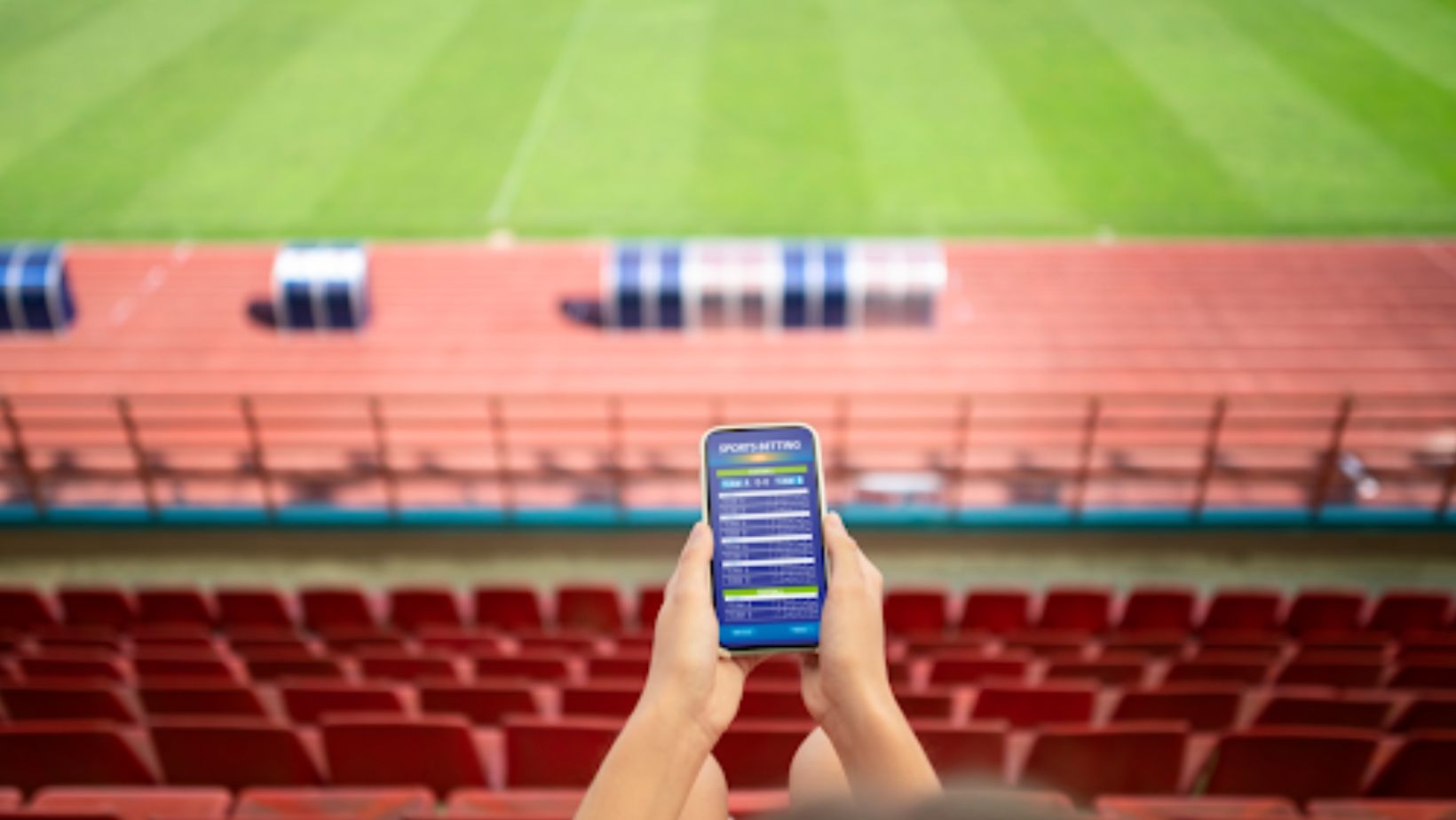
- The bet slip shows the full logic. For parlays (multiple selections combined into one bet), the app should display each leg, the combined odds, and what happens if one leg is voided, without forcing you into help menus.
- Confirmations are deliberate, not accidental. A final review screen that summarizes stake and potential return reduces misclicks, especially in live betting where prices move quickly.
- Errors are explained in plain language. If a market is suspended or a stake exceeds a limit, the message should say what happened and what you can do next, not just “Error 403.”
A useful rule: if an app repeatedly pushes you forward without showing a clear “review” step, it is increasing the chance of unforced mistakes. That is a UX risk, even if everything else looks professional.
Safety Controls That Matter: Limits, Time-Outs, And Self-Exclusion
Safety controls should be built into the account experience, not treated as a separate “responsible gaming” page you never visit. In Ontario, AGCO guidance describes limit-setting features as something players should be able to access easily, including financial and time-based limits.

What you should look for in practice:
- Deposit limits with sensible time windows. For example, Ontario Lottery and Gaming’s policy describes deposit limits offered over rolling periods such as 24 hours, about seven days, and about 30 days.
- Cooling-off or time-out options. A short break function is more useful when it is one or two taps away, not buried behind support tickets.
- Self-exclusion that is clearly explained. Ontario’s Centralized Self-Exclusion standards are set. Though the regulator hasn’t confirmed a public launch date yet, 2026 is the expected window for rollout.
Transparency Cues: Rules, Bet Settlement, And Customer Support
Most complaints about betting apps are not about “losing”, but confusion: why a bet was voided, how a price changed, what a cash-out number means, or what happens when a game is postponed.
A trustworthy app reduces that confusion by design:
- House rules are searchable and written for humans. Settlement and void rules should be organized by sport and bet type, with examples.
- Live-betting status is explicit. Suspended markets, delays, and reopens should be visually distinct so you do not think a tap was accepted when it was not.
- Support is reachable from the bet slip and the transaction history. If you need help, you are usually looking at a specific wager. The UX should connect support to that context.
This is where “trust” becomes measurable: fewer surprises, fewer hidden definitions, and clearer receipts.
A Quick Checklist Canadians Can Use Before Committing To An App
Use this as a fast scan. If you cannot check most of these boxes, move on.
- The app makes it obvious which jurisdiction’s framework you are using.
- Odds format and key settings are easy to find and change.
- The bet slip clearly shows stake, potential return, and full selection details.
- There is a deliberate review step before submitting a wager.
- Error messages explain what happened and how to fix it.
- Deposit limits and time-based limits are easy to locate in account settings.
- Self-exclusion information is clear and not buried.
- House rules and settlement policies are searchable and example-driven.
- Transaction history is detailed, with timestamps and clear labels.
- Support is reachable from within a specific bet or transaction screen.
None of this guarantees outcomes, but it does reduce preventable mistakes and makes the product easier to use responsibly. In a market as province-specific as Canada’s, that combination is what “trustworthy” should look like in practice.